project
The branding project is for a pilates studio, based in Edmonton, Canada. The main request of the client was to have a strong and visual brand, that could, thanks to the colors and shapes, transmit the well-being you feel while practicing the activity. The main shape created for the brand was inspired by the pilates circle ring and some pilates postures. The circle is then reshaped – for brand purposes – all over the website pages and the brand marketing supports. Colors are pastel based, to transmit a sense of harmony and wellness.
process
The process involved for the development was based on the Design Thinking process:
. discover and observe to identify the problems to be resolved;
. define all the questions te be solved;
. brainstorm and present all the ideas that come to mind;
. prototype the selected ideas. at this point, this is just testing the idea, so the prototype doesn’t need to be perfect, but best to have a clarified idea of what we’re getting into;
. test to a variety of users, make sure it resolved the initial problem(s), continue observing, and redefine if necessary.

print | business cards

digital | website
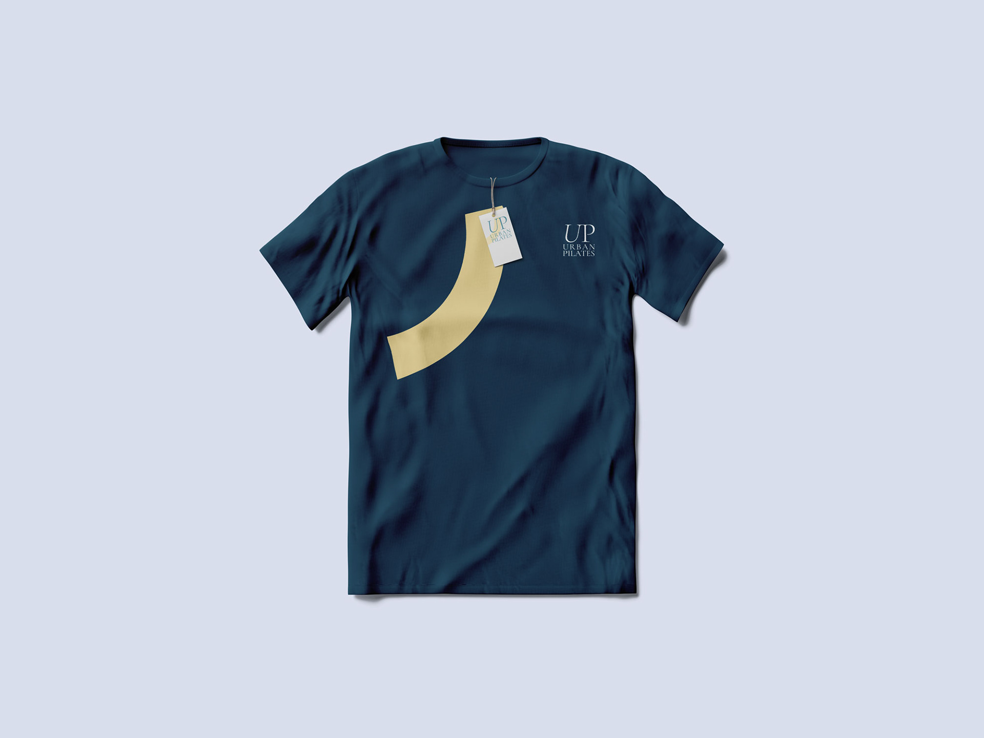
t-shirt
client
year
Urban Pilates
2020


